
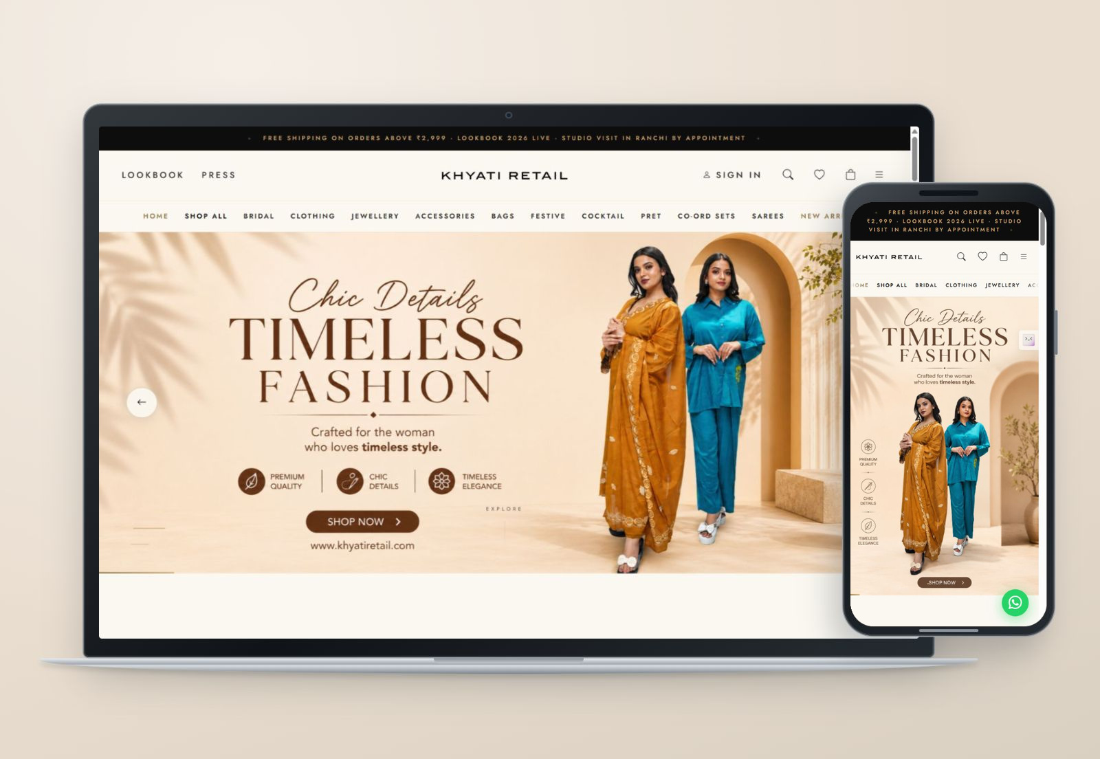
The project
Someone looking for an outfit may arrive with an occasion in mind, a particular garment in mind, or no clear starting point at all. The storefront has to make room for all three.
I personally designed and built Khyati Retail's website. The site combines a fashion storefront with editorial material about the designer, collections and studio. The work is in balancing those parts: enough atmosphere to introduce the clothes, and enough clarity to help someone browse.
For me, the imagery needs room to work. A clothing page becomes difficult to read when every photograph competes with badges, panels and sales messages. The layout uses larger collection moments, with the shopping routes kept close at hand.
Ways into the collection
Start with the occasion
The homepage groups collections around occasions including bridal, cocktail and festive dressing. That gives someone a useful starting point when they know why they are shopping but have not decided on a garment.
Keep direct routes available
The navigation also provides garment and category routes, including sarees, jewellery, accessories and bags. Editorial browsing and direct shopping can coexist. A returning visitor should not have to follow the entire homepage story to find a familiar category.
Give the designer a place in the experience
The site includes the designer's story, a lookbook and a studio-visit route. These pages carry a different conversation from the catalogue. They provide room for the work and its context, while the shop remains available to visitors ready to browse products.
Let the collection set the pace; keep the next step clear.
Desktop and mobile
These are real captures of the live homepage at desktop and mobile sizes. The device preview brings them together; the individual captures make the responsive layouts easier to inspect.
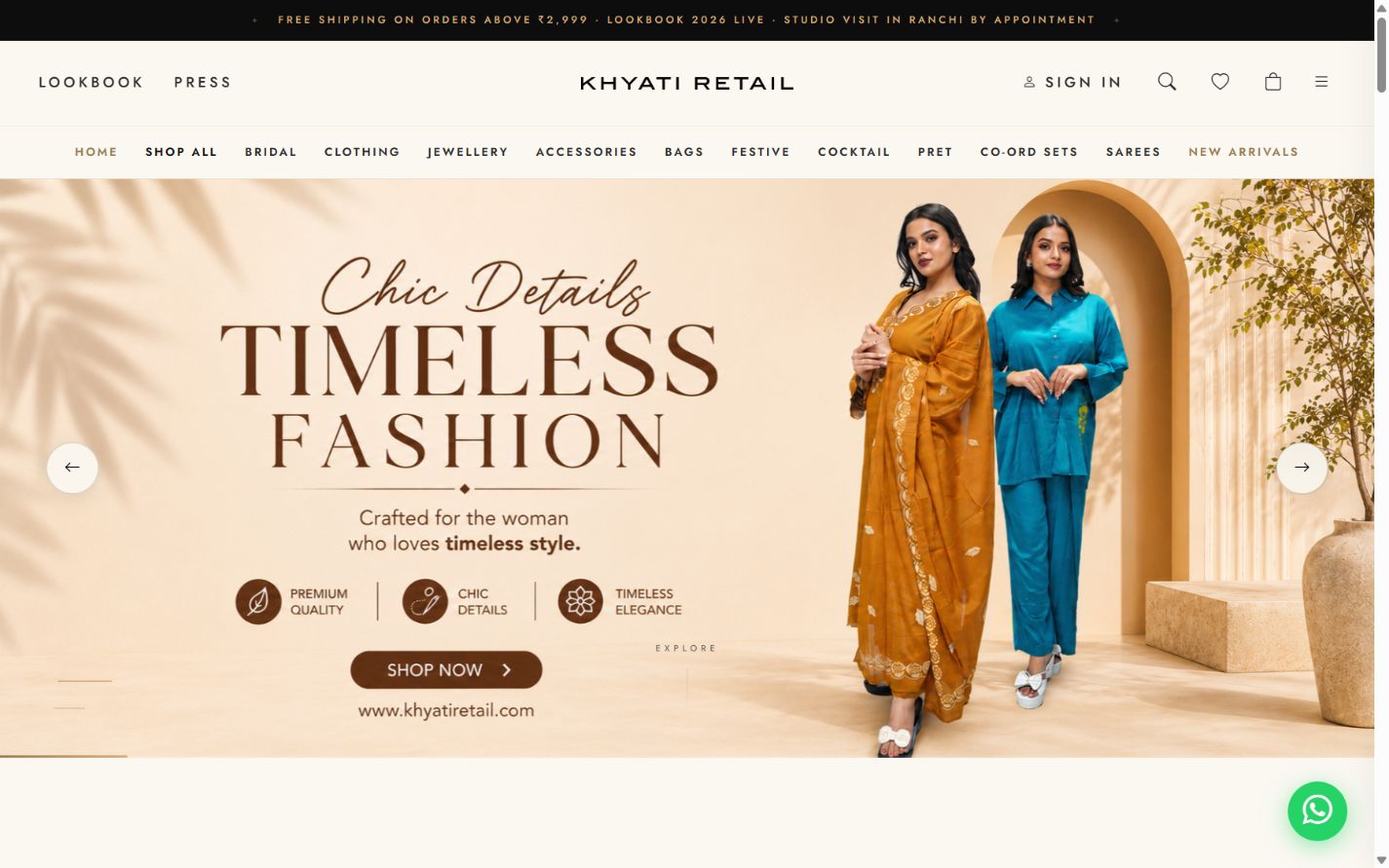
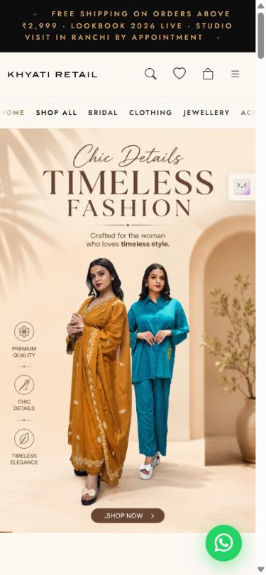
On a smaller screen, the important balance is between the image and the controls around it. Browsing needs space, but the menu, search, wishlist and bag still need to be reachable. I treat those as part of the storefront rather than additions to the visual design.
The shopping details
The site also provides routes to sizing, garment care, shipping, returns and order tracking. These may sit further down the page, but they answer questions that can matter more than another promotional banner.
My focus in this project is the relationship between presentation and use. The website should feel considered when someone first arrives and remain straightforward when they need a specific collection or a practical answer. The live site is the best way to see those parts together.