
The project
Buying fresh produce is the visible part of the service. Behind each basket, somebody has to keep stock current, prepare the order and get it to the right address.
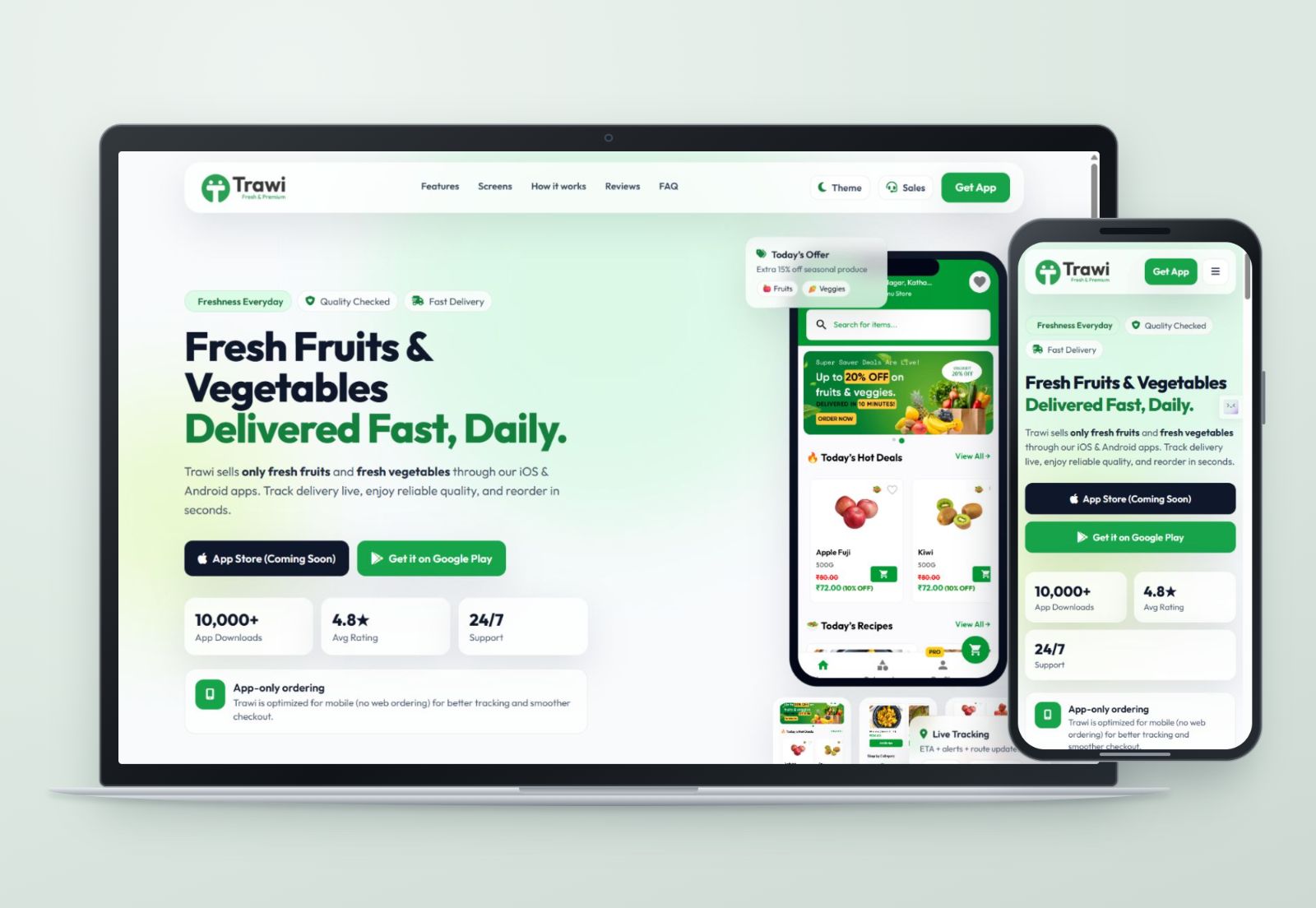
Trawi brings those tasks into a customer app, a Store Partner app and a Delivery Partner app. I personally designed and built all three, along with the website. The portfolio treats them as one project because an order passes through all of them.
The customer-facing offer is deliberately focused on fruits and vegetables. That focus gives the shopping experience a clear centre: find produce, understand the quantity and price, and know what happens after ordering.
Three people, three tasks
The customer is building a basket
Product imagery leads the shopping view. Names, pack sizes and prices sit alongside stock messages and quantity controls. In the published category screen, a low-stock label appears on the product itself. That is where it is useful, before someone tries to add more than is available.
The store is watching the queue
The Store Partner screen gives priority to order activity. New, pending, ongoing, delivered and cancelled orders have separate places in the dashboard. Inventory and store management are available through the navigation, while the main view stays focused on work arriving now.
The delivery partner needs the next job
The Delivery Partner app supports availability, assigned orders, delivery details and earnings. Its assignment screen brings the order and accept/reject actions into a single panel. That moment needs a clear decision, rather than another long dashboard to work through.
The same order needs different information at each handoff.
This is the main design distinction across the apps. Shopping, store operations and delivery share a brand, but they do not share the same priorities. I kept each interface centred on the person using it.
Screens and handoffs
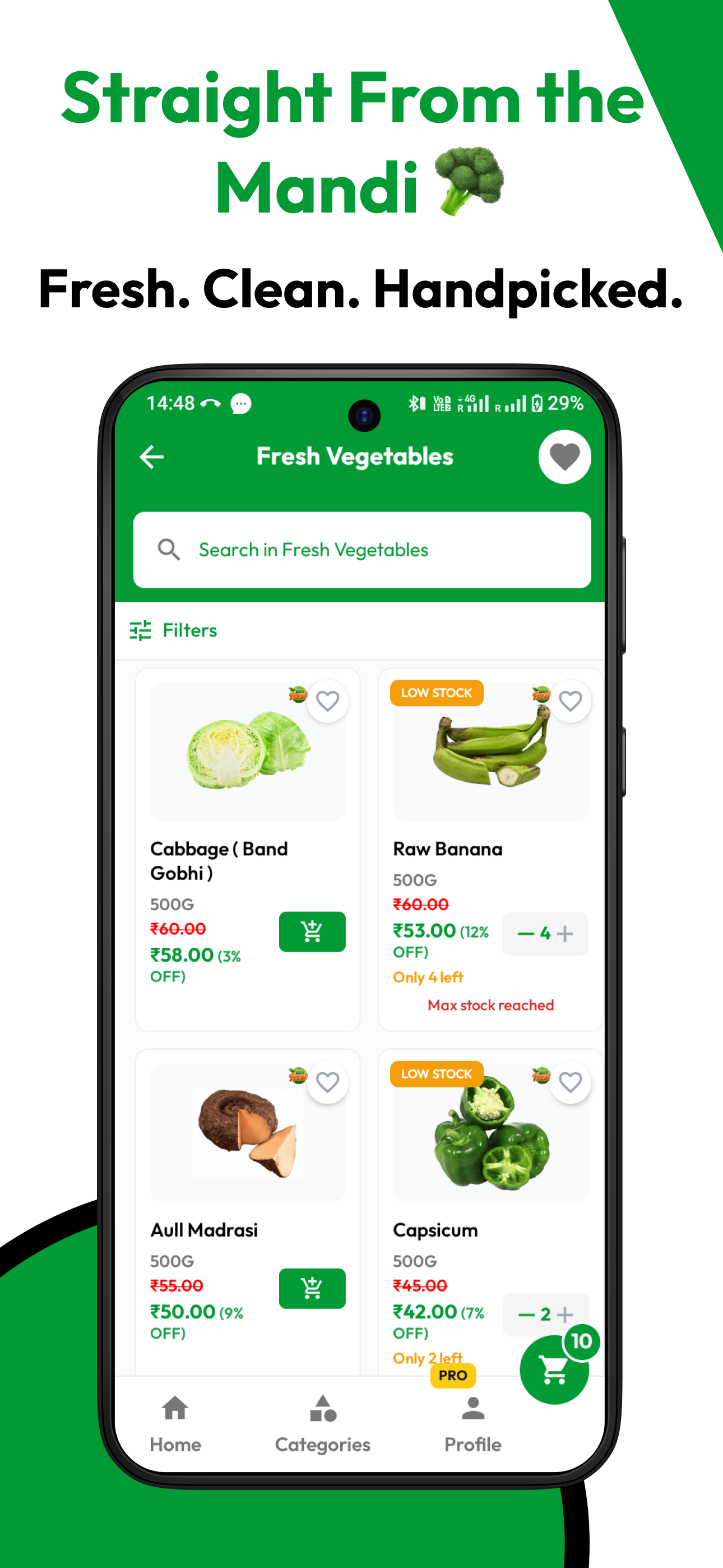
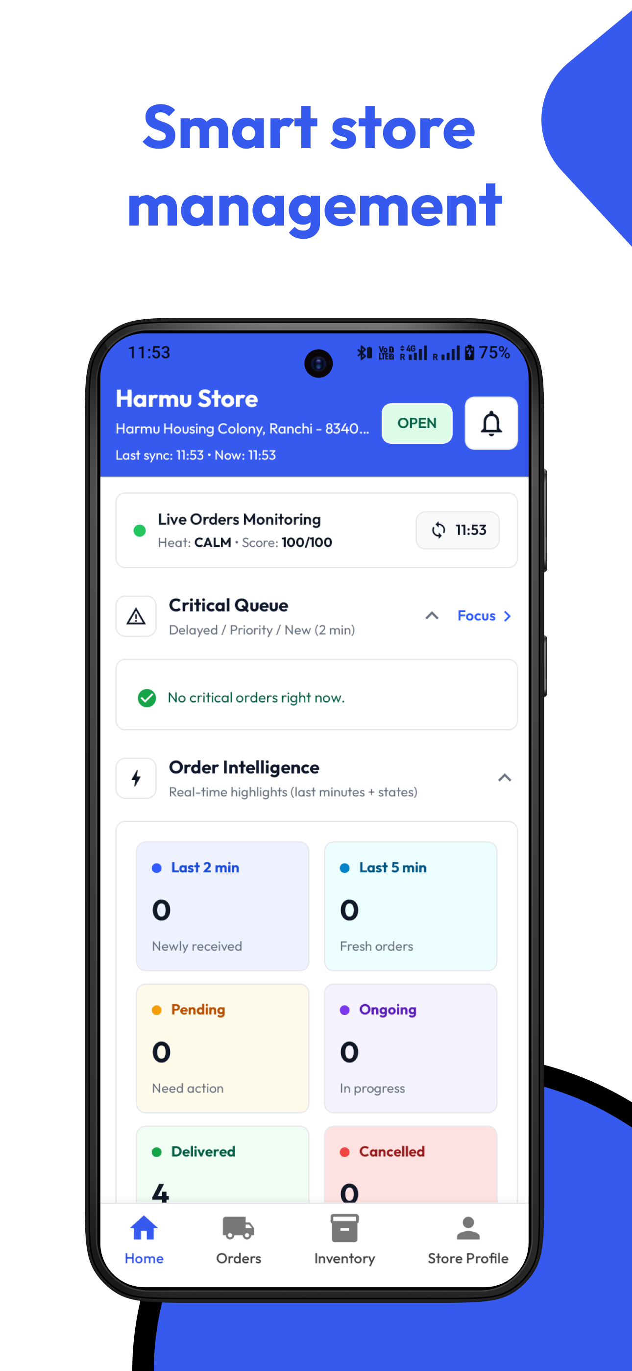
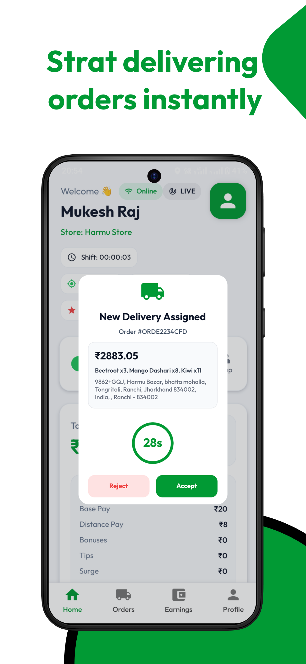
Select a screen to open the original full-size image.
Colour also helps separate the working contexts. The customer and delivery artwork use green; the store app uses blue. The repeated navigation patterns and direct labels keep the family recognisable, while each app retains its own working view.
For this kind of service, the less visible details deserve as much care as the shopping screen. A stock limit, a pending order or a delivery assignment is a place where the interface has to explain the current situation plainly.
The published apps
All three Android apps have public Google Play listings under Rimobit Infotech. The website introduces the produce service and points visitors to the customer app; the public site describes ordering as an app-based experience.
The screens in this study and in the portfolio are the original listing artwork. They document the released interfaces rather than a speculative redesign.